
An image can look excellent on a 27-inch desktop monitor and become almost impossible to understand on a phone.
That happens because most designers review their work at full size. The shopper usually does not. On the Amazon mobile app or a smartphone browser, the same product appears as a much smaller image where fine text disappears, small details blur, and the product has to compete with everything else on the screen.
That is why amazon mobile ready hero image optimization is not simply about shrinking a desktop graphic.
It is about deciding what needs to remain clear when the available viewing space becomes small.
This guide explains how to approach Amazon mobile image design, how the mobile app changes the way shoppers experience your gallery, what GS1's Mobile Ready Hero Image standard can teach us, and how to test whether your creative actually works.
Why Desktop-First Amazon Images Fail on Mobile
A desktop screen gives your design much more room to breathe. You can fit:
- Smaller type and multi-line bullet points
- Several supporting icons and badges
- Detailed technical callouts
- Wider, spacious compositions
- Complex visual infographics
A phone cannot give you the same space.
Once the image becomes small, the first things to disappear are fine text, subtle contrast, small icons, and secondary product details.
Amazon's own mobile guidance warns that content designed for desktop can become difficult to read after it is resized for mobile. For Brand Stores, Amazon provides mobile-specific image options for supported content because desktop and mobile layouts differ significantly.
Desktop vs. Mobile Screen Behavior
The practical lesson is simple: don't approve a mobile image from your desktop monitor. Always check it on an actual phone.
What Amazon Mobile Image Optimization Really Means
Mobile optimization doesn't mean making every element bigger. It means deciding what deserves attention first.
A proven visual hierarchy:
1. Product Identity ➔ 2. Core Benefit / Value Prop ➔ 3. Supporting Technical Details
Anything below that hierarchy should be simplified, moved to a secondary image, or removed entirely.
This is especially important for Amazon listing images because the shopper moves through images quickly. Your first image doesn't need to explain everything: it needs to make the product easy to identify.
The 4 Rules of Mobile-First Amazon Creative
1. Use the Three-Second Squint Test
Take the image and view it on your phone at approximately the size a shopper sees it. Do not zoom in. Look at it normally, then ask:
- What do I notice first?
- Can I identify the product immediately?
- Can I understand the main benefit or purpose?
- Can I tell what makes it different from competitors?
If you have to study the image before answering those questions, the design is carrying too much visual friction.
GS1's Mobile Ready Hero Image guidance is built around a similar principle: important product information must remain perceivable on small digital screens.
2. Use Large, Simple Typography Where Text Is Allowed
This rule applies to secondary listing graphics, Brand Store content, A+ Content, and other image formats where text is permitted.
When text matters, make it readable without zooming:
- Shorter headlines (3 to 5 words max)
- Larger font sizes
- High-contrast text containers
- Zero multi-paragraph body text
This does not mean adding text to the Amazon MAIN image (added text in the hero slot is prohibited under Amazon's core guidelines, as covered in our guide on 7 main image mistakes hurting CTR).
3. Build Strong Contrast Around the Important Element
Mobile screens reduce the amount of visual information a shopper can process at once. That makes weak contrast much more noticeable.
Look at the separation between:
- Product outline and the pure white background
- Headline text and background image
- Feature icons and their containers
- Foreground hero unit and supporting elements
The goal isn't to make everything extremely saturated. The goal is to make the primary element easy to spot first.
4. Remove Visual Noise
A designer can fit a lot of information into a large 2,000-pixel canvas. That doesn't mean all of it belongs there.
A 50-word infographic becomes almost unreadable when reduced to a 300-pixel mobile screen.
Instead of asking: “How much information can we fit?”, ask:
“What is the one thing the shopper needs to understand from this image?”
Then remove everything that gets in the way of that single message.
Design for the Amazon Mobile App and Image Carousel
Mobile also changes how shoppers move through your listing.
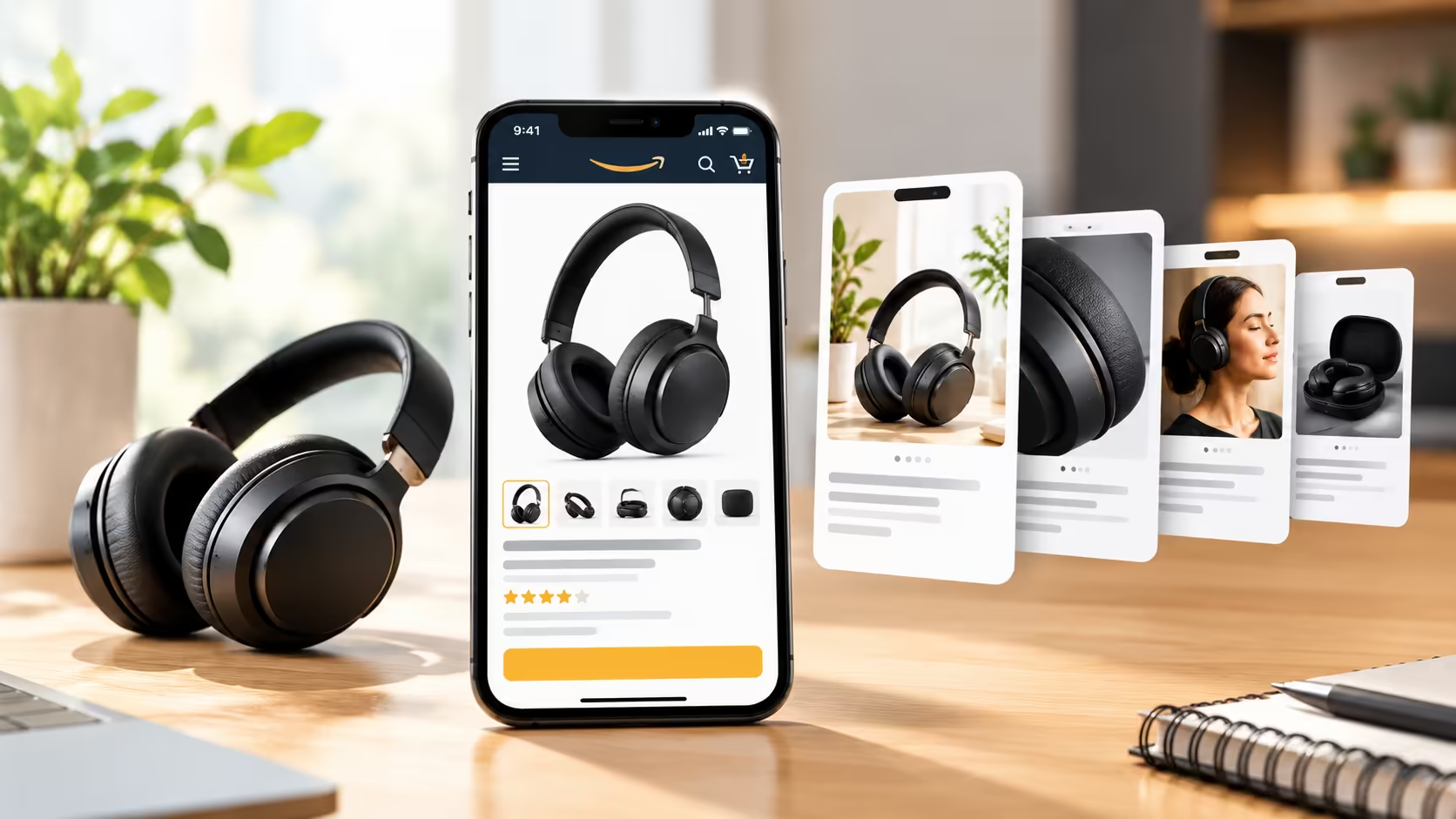
On a desktop, more of the page is visible at once. On a phone, the current image takes up most of the screen, and the shopper swipes through the gallery horizontally.
That means the gallery should be treated as a logical sequence, not six unrelated posters:
The core principle: don't make every image repeat the same message. Give the shopper a compelling visual reason to swipe to the next frame.
How to Design Amazon Store Images for Desktop and Mobile
If you are designing Brand Store images, don't start by making the desktop version and then shrinking it down.
Start by asking: “What has to remain visible on mobile?”
For mobile-first Store design, prioritize:
- One clear focal point
- Short, punchy headlines
- Large, readable type
- Simple visual hierarchy
- Strong contrast and clean margins
- Minimal decorative clutter
The desktop version can then utilize the additional space where it genuinely helps.
What GS1 Mobile Ready Hero Images Can Teach Amazon Sellers
GS1's Mobile Ready Hero Image (MRHI) standard was created for digital retail environments where shoppers browse on relatively small screens.
The useful part for Amazon sellers is the emphasis on quick product recognition, often structured around the 4Ws:
A shopper should be able to recognize the product without having to decode the image. That principle transfers directly to Amazon listing optimization.
Do Not Confuse GS1 Specifications With Amazon Requirements
GS1's specification references a 600 × 600 px minimum, JPG/PNG format, and sRGB color profile. Those are GS1 specifications, not Amazon requirements.
Amazon has its own image rules (such as 1,600+ px for desktop hover zoom). The value of the GS1 standard is the design philosophy: make the product recognizable and useful even when the display area becomes small.
Why 50 Words on One Image Fails on Mobile
Take a large desktop infographic containing a headline, four feature descriptions, several icons, supporting copy, a comparison, and two product callouts.
When reduced to a phone screen, the information doesn't disappear: it becomes painful to consume.
The 4-Draft Pruning Process
- First Draft: Write everything the image needs to communicate.
- Second Draft: Remove information that is already covered elsewhere in the listing.
- Third Draft: Keep only the primary message and the strongest supporting visual.
- Final Test: View it on an actual phone. If it still feels crowded, remove more text.
Mobile Hero Image Design: Make the Product Do More Work
Your product itself should carry as much of the visual message as possible:
- Strong Product Scale: Fill 85% to 92% of the frame without excessive whitespace margins.
- Clear Product Orientation: Choose a 3/4 angle or direct front view that makes the product easiest to understand.
- Strong Material Definition: Make surfaces, edges, and physical textures readable.
- Controlled Contrast: Separate the subject cleanly from the surrounding background.
A good mobile hero image doesn't need more graphic effects: it needs less visual friction. (For design strategies, read our guide on high-converting Amazon product images).
Where 3D Product Rendering Helps on Mobile
3D CAD rendering is especially useful when creating tightly controlled mobile assets:
- Pixel-Perfect Framing: Zoom in and crop precisely to 90%+ canvas fill without pixelation.
- Angle & Rotation Control: Adjust the camera perspective to make packaging labels face directly forward.
- Controlled Reflections: Eliminate harsh studio glare on metallic or glass products that would otherwise wash out text on small screens.
- Multi-SKU Consistency: Maintain identical lighting and scale across 20 different variations.
3D visualization gives creative teams total repeatability across complex product lines.
Desktop vs. Mobile Design: What Should Change?
How to Test Your Mobile Creative
Do not approve a mobile image because it looks impressive in a design presentation. Test the actual customer experience:
- Step 1: Open the listing on your phone using the native Amazon app.
- Step 2: Look at the first image without zooming in. What do you understand immediately?
- Step 3: Swipe through the gallery. Does each swipe add a new, compelling piece of information?
- Step 4: Check the text. Can you read the primary headlines without pinching to zoom?
- Step 5: Look for disappearing details. Do important product features vanish at thumbnail scale?
- Step 6: Open a competitor and compare their listing on the exact same phone screen.
- Step 7: Record specific feedback on concrete visual friction points.
Test Changes With Amazon's Manage Your Experiments (MYE)
When your brand is eligible, use Amazon's Manage Your Experiments tool to test your mobile-optimized images against your existing assets. (See our benchmarks on what is a good Amazon click-through rate to analyze the performance shift).
Amazon evaluates customer response, including downstream conversion rates and total unit sales.
The Mobile Image Audit Checklist
Before publishing your listing imagery, run through this final checklist:
- ☑ Product is instantly recognizable on a smartphone screen
- ☑ One clear visual focal point per image
- ☑ Essential product information survives at small thumbnail size
- ☑ Secondary image text is large, clean, and readable without zooming
- ☑ Product fills at least 85% of the frame without awkward cropping
- ☑ High contrast separates the product cleanly from the background
- ☑ Unnecessary visual noise, paragraphs, and tiny icons have been removed
- ☑ Each gallery image has a distinct, non-repetitive purpose
- ☑ The image carousel flows logically when swiped horizontally
- ☑ Reviewed side-by-side against top page-one competitors on a mobile device
- ☑ Configured for live A/B testing via Manage Your Experiments
Frequently Asked Questions (FAQ)
What is Amazon mobile image optimization?
Amazon mobile image optimization is the process of designing listing imagery so that essential product details, benefits, and value propositions remain clear and readable on smaller smartphone screens. It focuses on product scale, typography hierarchy, high contrast, and sequential carousel storytelling.
Should I create separate mobile images for Amazon?
For supported Brand Store modules, Amazon provides mobile-specific image upload fields. For standard product detail page listings, Amazon uses a single image gallery that resizes across devices; therefore, listing creative must be designed mobile-first so it performs effectively on small screens without breaking on desktop.
What is a GS1 Mobile Ready Hero Image?
A GS1 Mobile Ready Hero Image is an industry design framework created to ensure digital retail products are immediately identifiable on mobile screens by clearly communicating the 4Ws: Who (Brand), What (Product), Which (Variant), and How Much (Quantity).
Can 3D product rendering improve mobile Amazon images?
Yes. 3D rendering allows designers to eliminate lens distortion, control reflections, and scale packaging to maximize frame fill without the physical limitations of studio photography.
Design for the Small Screen First
A mobile-ready Amazon image isn't simply a smaller desktop image: the designer must make deliberate priority decisions.
- What does the shopper need to see first?
- What can be removed without weakening the core message?
- What typography needs to be enlarged?
- What should be moved to the next image in the swipe sequence?
Start with the product. Make the most important value proposition obvious. Strip away unnecessary visual clutter, and verify the customer experience on an actual smartphone.
That is the foundation of effective Amazon mobile image optimization.
At Grow Orbit, we help brands build high-converting, mobile-ready Amazon image systems from hero visuals to full listing carousels.
Want to optimize your Amazon images for mobile shoppers? Book a free 30-minute creative strategy session with our Amazon listing team.
📅 BOOK A FREE 1-ON-1 STRATEGY MEETING