
A strong Amazon A+ Content design does not begin with choosing the most attractive template. It begins with a much simpler question: what does the shopper still need to understand before buying?
If the title, bullet points, and image gallery already explain the product, A+ should add depth rather than repeat them. It can show how a product works, explain important features, clarify technical details, answer common objections, and help shoppers understand the difference between related products.
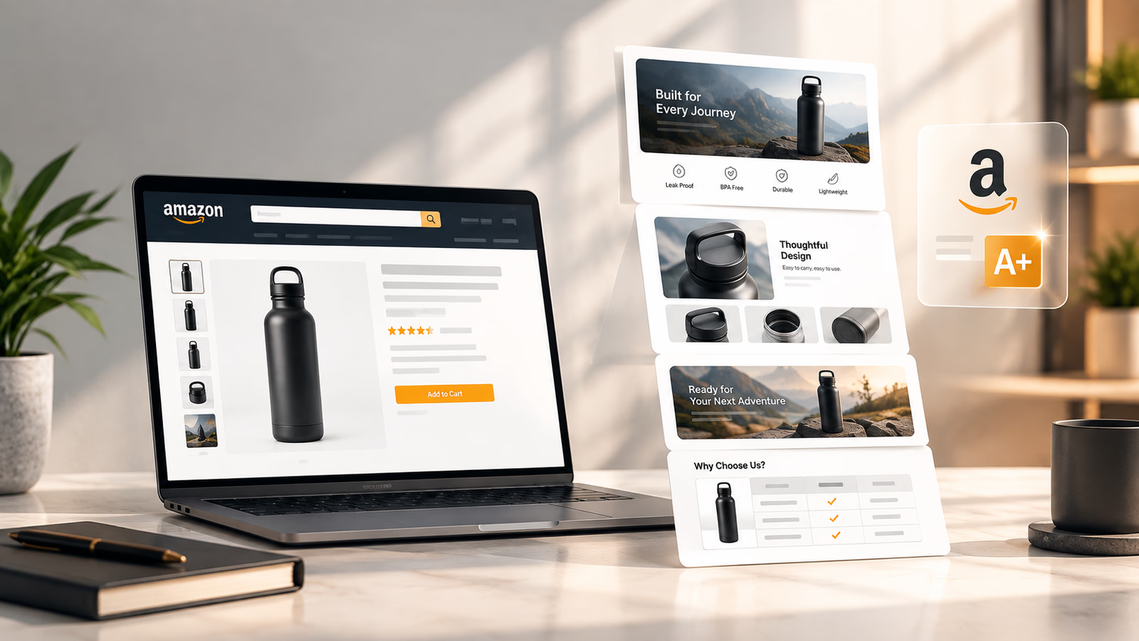
Amazon describes A+ Content as a way for eligible brands to add richer images, text, comparison charts, and other content to product detail pages. Premium A+ adds options such as video, interactive hotspots, carousels, and Q&A (Sell on Amazon).
The difference between a page that simply looks polished and one that is genuinely useful comes down to what you choose to communicate.
What Is A Plus Content on Amazon?
When brands explore amazon a content design, understanding system boundaries is critical. A+ Content is Amazon's enhanced product detail page content system that allows eligible brands to use richer text, images, comparison charts, and other modules to explain products in more detail.
Basic A+ Content appears in the Product Description area of the detail page. Premium A+ offers additional visual and interactive capabilities.
Amazon's current documentation identifies Basic A+ and Premium A+ as separate content types, while Brand Story is used to communicate the wider brand narrative and catalog.
What Happened to EBC?
If you have searched for ebc design amazon, Amazon EBC graphic design, or "Enhanced Brand Content", you are usually looking for what Amazon now calls A+ Content.
EBC stands for Enhanced Brand Content, the older terminology used for the same general product page enhancement system.
The terminology changed, but the design problem is still familiar: how do you use additional visual space to make a product easier to understand and easier to choose? That is what good A+ Content should solve.
Who Can Use A+ Content?
Amazon currently states that A+ Content is available to Professional sellers who have the appropriate brand relationship through Amazon Brand Registry. Amazon also documents access for generic products under specific limitations (Sell on Amazon).
For branded products, the normal eligibility sequence requires:
- Professional selling account
- Amazon Brand Registry enrollment
- Brand Representative or Reseller role assigned
- Access granted in A+ Content Manager
Premium A+ has additional eligibility requirements. Amazon currently lists Brand Story publication across the brand's owned ASINs and at least five approved and published A+ Content projects within the previous 12 months among those requirements. Amazon also says Premium eligibility is evaluated automatically (Amazon Seller Central).
Because Amazon can change program eligibility, always check your current A+ Content Manager before planning a project around Premium-only modules.
Basic A+ vs Premium A+
The difference between standard and premium tiers reflects both layout dimensions and interactive tools:
Amazon's current guidance lists up to five Basic A+ modules from 14 available types and up to seven Premium modules from 19 available types. Premium also adds larger image formats, video, interactive hotspots, navigation carousels, Q&A, and enhanced comparison capabilities (Sell on Amazon).
The important point is not the raw number of modules. It is whether you have a reason to use them.
A simple kitchen accessory may have little to gain from interactive modules. A technical product with multiple components, use cases, and purchase objections will benefit substantially from the additional space and functionality.
How to Structure A+ Content
A+ Content works best when the modules feel connected. Instead of choosing modules first, build the page around the shopper's questions.
1. Start with the Product and Core Value
The first section should make the product and its central value obvious. For example:
More Organized Storage for Smaller Spaces
Then show the product in a realistic environment. The opening module does not need to explain every specification. It needs to establish why the shopper should continue reading.
2. Move Into the Main Benefits
Once the product is clear, explain the reasons it deserves consideration:
- Faster Setup: Get the product ready with fewer steps.
- Flexible Positioning: Adjust it for different environments.
- Built for Daily Use: Construction designed around repeated use.
These are examples only. Your actual benefits should come from the product's verified capabilities.
3. Explain How Those Benefits Are Delivered
This is where feature graphics, product callouts, close-ups, and 3D visualizations become useful.
Instead of saying:
Reinforced aluminum structure
show the exact component that makes the construction meaningful. The shopper should understand not just what the product has, but why that engineering detail matters.
4. Add Technical Specifications
Technical specifications become easier to appreciate once the product and benefits are clear. Depending on the category, useful information may include:
- Dimensions and weight
- Battery life and charging capacity
- System compatibility and port types
- Materials and food-grade safety certifications
- Included components and accessories
- Installation requirements and clear clearances
Amazon's own A+ guidance recommends using technical specifications to help customers understand important product details.
5. Remove Final Purchase Objections
The final modules should systematically answer lingering customer doubts:
- Will this fit my space?
- Is it compatible with my existing setup?
- What exact items come in the box?
- How does the installation process work?
- Which version or size should I choose?
- How should the product be maintained and cleaned?
Amazon specifically recommends using A+ to answer common customer questions, and Premium A+ includes a dedicated Q&A module for this purpose.
5 A+ Content Design Best Practices
1. Design Around Buying Questions, Not Templates
Templates are starting points. Your product should determine the final structure.
Take a standing desk. Instead of starting with "Which three-column module should I use?", start with the shopper's primary friction points:
- How stable is it at maximum height?
- How does the height adjustment mechanism work?
- Will it fit my workspace dimensions?
- What is the maximum weight capacity?
Now the content has a distinct purpose. The module is simply the format used to answer one of those questions. This approach also prevents A+ from becoming a lazy repetition of the title and bullet points.
2. Give Every Section One Primary Message
A section can contain supporting information, but it should still focus on one clear idea.
For example, a crowded module might list stainless steel, BPA-free, leakproof lid, wide mouth, powder coating, dishwasher safe, 24 oz capacity, hot retention, and cold retention all at once. The shopper has to work to decide which point matters.
A better module leads with one primary hook:
KEEPS DRINKS COLD FOR 24 HOURS
Then use a clear product visualization to explain the double-wall vacuum insulation. The technical specification still matters, but it now has a clear contextual reason for being there.
3. Let Imagery Demonstrate What Words Cannot
One of the biggest opportunities in Amazon A+ Content design is replacing wordy explanations with visual proof.
Suppose a product features an innovative folding mechanism. A long paragraph can describe how it folds, but a sequential graphic demonstrating open, folded, and stored states is understood instantaneously.
The same principle works across categories:
- Mechanical components and gear systems
- Adjustable parts and telescopic extensions
- Step-by-step installation guides
- True physical scale against familiar items
- Internal construction and layered materials
- Multi-device compatibility matrices
- Modular configurations and add-ons
Amazon's A+ guidance encourages the use of images and rich content to explain product features and considerations that may be difficult to communicate through plain text alone.
4. Design for Mobile Before Finalizing Desktop
An A+ layout can look balanced on a large monitor yet become unreadable on a phone screen. Check the actual mobile preview for:
- Headline font size and minimum legibility
- Unintended text wrapping
- Product framing and visibility
- Image cropping on narrow viewports
- Comparison table horizontal scrolling
- Vertical spacing between modules
- Text embedded inside graphics
Amazon's A+ design guidance recommends previewing content on both desktop and mobile, warning against embedded text that becomes unreadable when images scale down.
A practical test is simple: can you read and understand every graphic on a mobile device without pinching to zoom? If not, simplify the asset.
5. Write Useful, Descriptive Alt Text
Alt text should describe the image for accessibility, not serve as a keyword repository.
Amazon requires alt text for A+ images and confirms it is intended to support customers using screen readers. Amazon also states that descriptive alt text can help products appear in search results (Amazon Seller Central).
- Effective alt text: Matte black wireless over-ear headphones resting on an oak desk beside an open laptop.
- Weak alt text: Best premium wireless headphones Amazon cheap Bluetooth headphones sale.
The first describes the actual visual scene for assistive technology. The second is obvious, ineffective keyword stuffing.
When to Use 3D Rendering in A+ Content
3D rendering is valuable when the physical product contains internal details that are difficult or impossible to communicate through ordinary studio photography.
Consider a complex technical appliance with multiple internal filters and motor stages. A standard photograph requires distracting arrows, labels, and cutouts. An exploded 3D view can elegantly separate the outer housing, removable container, internal filtration assembly, and high-torque motor section, giving the shopper an immediate understanding of the engineering quality.
3D visualization also becomes efficient when one accurate digital CAD model supports multiple marketing assets:
- Micro-detail technical close-ups
- Consistent multi-angle product rotations
- Exploded views showing component assemblies
- Custom exploded feature graphics
- Cross-sell comparison visuals
- Controlled lifestyle environments without physical staging costs
However, there is no reason to turn every A+ project into a CGI showcase. Traditional photography remains superior when authentic fabric texture, real-world human hand interaction, or genuine environmental warmth is central to the purchase decision.
The strategic question is: which production method explains this product most honestly and clearly? Often, the optimal listing leverages both photography and 3D rendering in harmony.
Case Study: Kazvo Listing Images and A+ Content Redesign
A useful A+ discussion should not rely entirely on hypothetical examples. Grow Orbit's published case study for Kazvo Health & Personal Care documents a comprehensive engagement involving both listing image production and complete A+ Content design.
Kazvo's product was a premium nose and ear hair trimmer. Original listing imagery failed to communicate the product's engineering quality, resulting in high bounce rates. Our redesign focused on precision stainless steel blades, IPX7 waterproof design, and an ultra-quiet micro-motor.
Published project assets show A+ modules covering the brand header, precision blade close-ups, hygienic cleaning routines, and ergonomic design (Kazvo Case Study).
There is an important qualification here. These results should not be presented as evidence that A+ Content alone produced a 75% conversion increase. The project combined optimized main gallery images and A+ Content, meaning the reported gains reflect the broader creative overhaul.
What the project demonstrates is the immense commercial value of treating the listing's visual assets as one connected, coherent system.
How A+ Fits Into the Rest of Your Listing
A+ should extend the product page rather than duplicate existing content. A practical information architecture model divides responsibilities across listing zones:
- Title: What is this product?
- Bullet Points: What does it do and what are its key features?
- Image Gallery: What does it look like, how does it function, and what is included?
- A+ Content: What else does the shopper need to understand before buying?
- Brand Story: Who is behind the product and what does the brand stand for?
Amazon itself recommends using A+ to highlight product benefits and features, provide additional details, and address common customer questions.
For example, if your bullet point mentions an adjustment range of 28 to 48 inches, the A+ module should visually demonstrate that full range in a domestic setting. If your bullet point notes multi-device compatibility, the A+ section should illustrate those connections through a clean compatibility grid.
The goal is not to avoid all repetition, but to make the repetition informative and visual. When planning your listing architecture, partnering with dedicated specialists in A+ Content design helps ensure every asset aligns cohesively across the buyer journey.
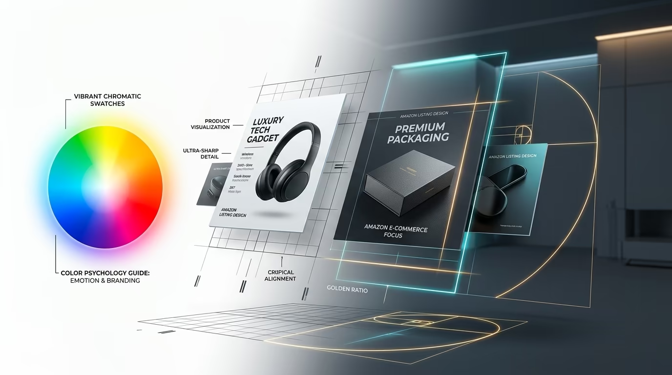
For a deeper look at structuring the main image gallery before shoppers reach A+, explore our guide on the best order for Amazon listing images. For visual hierarchy, contrast, and color palette strategy, review our Amazon product image color psychology and composition guide.
A+ Content and the Plain-Text Description
One critical implementation detail is easy to miss.
Amazon's A+ documentation explains that when A+ Content is published, it suppresses the standard plain-text product description from the public detail page. Amazon recommends ensuring that the A+ version contains all essential information while keeping the underlying inventory description updated in Seller Central (Amazon Seller Central).
Before replacing your text description with A+ graphics, compare both versions line by line. An aesthetically attractive page should never become an incomplete one.
Always ask: what critical dimensions, warnings, or specifications existed in the old description that must be preserved within the new A+ modules?
A+ Content and Conversion Performance
A+ Content should never be pitched as a magic bullet that fixes unprofitable advertising. PPC and advertising performance depend on foundational retail factors:
- Traffic quality and search intent alignment
- Keyword targeting and bid optimization
- Competitive price positioning
- Review velocity and star rating average
- Stock availability and Prime shipping speed
- Baseline listing conversion efficiency
A+ Content enters the equation only after the shopper clicks through to the detail page.
Amazon states that A+ Content helps build brand trust, convey detailed product insights, and increase sales. Amazon's official documentation reports that Basic A+ Content can increase sales by up to 8%, while well-implemented Premium A+ Content can lift sales by up to 20%, based on internal Amazon metrics (Sell on Amazon).
These figures should be interpreted realistically. They represent aggregated platform averages rather than guaranteed results for any individual ASIN.
A realistic conversion funnel model operates across distinct stages:
- Qualified traffic arrives on the listing via organic search or PPC
- Shopper evaluates the primary image gallery and pricing
- Shopper scrolls into A+ Content to resolve specific purchase friction
- Structured visual modules deliver deeper understanding and confidence
- Frictionless clarity yields conversion rate improvement and lower return rates
This is why A+ Content directly impacts advertising economics without functioning as a manual PPC bid lever. Higher conversion efficiency allows brands to maximize the return on every paid click.
How We Approach Amazon A+ Content Design Services
Professional amazon a+ content design services involve far more than assembling pre-made graphic templates. At Grow Orbit, our methodology connects creative assets to the commercial realities of the Amazon marketplace:
- Research the Shopper: Identify critical purchase questions, recurring customer objections in reviews, competitor review gaps, and catalog positioning.
- Architect Information Flow: Strategically distribute content across the main image gallery, A+ modules, Brand Story, bullet points, and comparison matrices.
- Establish the Visual System: Define brand typography, color palettes, image treatments, iconography, lighting styles, and 3D rendering consistency.
- Produce Bespoke Assets: Create custom 3D models, lifestyle composite imagery, feature infographics, technical callout diagrams, and cross-sell comparison modules.
- Review Compliance and Mobile Layout: Inspect every module against Amazon content restrictions, verify alt text quality, check mobile legibility, and validate claim substantiation.
The ultimate objective is not to crowd the page with flashy graphics, but to make the product effortlessly clear to potential buyers.
Want to uncover why your listing is leaking conversions? Book a zero-pressure review with our creative team to audit your A+ architecture and listing visuals.
📅 BOOK A FREE 1-ON-1 A+ STRATEGY AUDITA+ Content Compliance Checklist
Before submitting modules in Seller Central, review your content against Amazon's strict compliance policies:
- Claims and Substantiation: Are performance claims truthful and verifiable? Can awards and certifications be substantiated with documented proof? Have unsupported superlatives such as "the greatest" or "number one" been eliminated?
- Content Restrictions: Amazon prohibits pricing references, promotional phrasing such as "cheap" or "affordable", external website links, QR codes, direct competitor comparisons by brand name, and unsubstantiated health claims.
- Image Quality Standards: Images must meet minimum resolution requirements. Blurry, pixelated, or watermarked imagery will trigger submission rejections. Text embedded inside graphics must remain legible on mobile viewports (Amazon Seller Central).
- Accessibility Standards: Provide descriptive, helpful alt text for every uploaded asset. Describe the visual content clearly rather than cramming keywords into alt fields (Amazon Seller Central).
- AI-Generated People Disclosures: Amazon enforces disclosure requirements for applicable media containing photorealistic AI-generated humans. Review current regional policies before uploading synthetic human models (Amazon Seller Central).
- Pre-Launch Verification: Preview the content across desktop and mobile views, verify every dimension and specification against the physical packaging, and ensure no critical legacy information was lost.
How to Test Your A+ Content with Experiments
Creative intuition is useful, but empirical sales data is decisive.
Amazon's Manage Your Experiments tool enables eligible brand owners to run controlled A/B split tests on listing content, tracking measurable metrics including units sold, revenue, and conversion rates (Sell on Amazon).
When planning an A+ Content experiment, compare two distinct strategic hypotheses rather than minor decorative tweaks:
- Version A: Technical-first structure leading with engineering cutaways and specification tables.
- Version B: Lifestyle-first structure leading with practical benefit demonstrations and real-world usage scenarios.
Formulate a testable hypothesis:
A benefit-first A+ layout will improve conversion rate because shoppers grasp the core daily utility of the product before evaluating technical details.
Amazon advises running split tests until statistical significance is achieved, recommending an 8 to 10 week duration for manual tests. Treat every split test as an opportunity to build documented customer insights.
8-Point A+ Content Quality Audit
Before submitting your modules for moderation, evaluate your layout using this diagnostic checklist:
- Does the opening module define the product immediately? The shopper should never have to scroll past multiple banners to identify what is being sold.
- Does every module provide distinct, additive information? Redundancy between modules is the fastest way to lose customer attention.
- Is the primary purchase benefit unmistakable? If a customer scans the page in 5 seconds, can they name your main competitive advantage?
- Are critical specifications and compatibility details simple to find? Dimensions, materials, and hardware requirements should be highlighted in dedicated modules.
- Do your graphics visually substantiate every key claim? Whenever possible, visually demonstrate mechanisms, waterproof ratings, or material thickness rather than merely stating them in text.
- Is every graphic fully legible on mobile devices? Preview all assets on actual smartphones to confirm that font sizes and graphics do not require zooming.
- Have you answered top customer objections? Review customer questions and negative competitor reviews to ensure every common hesitation is addressed upfront.
- Does the closing module provide clear direction? Conclude with a helpful cross-sell comparison chart or warranty guideline that guides the shopper toward a confident purchase.
A high-performing A+ page is not the one with the highest module count. It is the page with the least wasted space.
Frequently Asked Questions
What is Amazon A+ Content design?
Amazon A+ Content design is the strategic planning and graphic creation of enhanced product detail page modules using high-resolution images, structured copy, comparison tables, and interactive media. Its core purpose is to answer customer questions, demonstrate product value, and guide buyers toward confident purchasing decisions.
What is the difference between Basic A+ and Premium A+?
Basic A+ provides up to five content modules from 14 standard layout options, including feature banners, technical lists, and comparison grids. Premium A+ allows up to seven modules from 19 expanded layouts, adding video integration, interactive hotspots, navigation carousels, and dedicated Q&A modules.
What is EBC design on Amazon?
EBC stands for Enhanced Brand Content, which was the legacy name for Amazon's detail page visual module system. While sellers frequently search for terms like Amazon EBC graphic design, Amazon officially replaced EBC with the standardized A+ Content framework.
Does A+ Content improve conversion rates?
Yes. According to Amazon internal data, publishing Basic A+ Content can increase sales by up to 8%, while comprehensive Premium A+ Content can generate conversion lifts of up to 20%. Actual performance gains depend on product quality, competitive positioning, and baseline traffic.
Should A+ Content repeat the bullet points?
No. A+ Content should expand upon the bullet points by providing visual proof, detailed dimensions, and technical depth rather than repeating the same copy word for word. Use A+ to show what the bullet points merely describe.
Does A+ Content help Amazon SEO?
A+ Content does not index body text for organic Amazon search rankings in the same direct manner as product titles and backend search terms. However, descriptive image alt text is indexed by search engines and supports accessibility. Furthermore, higher conversion rates generated by A+ Content positively influence Amazon's organic sales velocity algorithms.
Is Premium A+ worth using?
Premium A+ is highly worthwhile for complex, technical, or premium catalog items where interactive video, navigation carousels, and hotspots resolve complicated pre-purchase questions. For simple, low-cost commodity products, Basic A+ modules are frequently more than adequate.
Can I test different A+ Content designs?
Yes. Eligible brand owners can utilize Amazon's Manage Your Experiments tool to run controlled A/B split tests comparing two versions of A+ Content to determine which layout produces higher sales and conversion rates.
Final Takeaways on Amazon A+ Content Design
Effective Amazon A+ Content design gives brands the creative canvas to articulate what makes their product exceptional, but additional digital real estate alone does not guarantee sales.
- Anchor your layout around customer buying friction rather than decorative templates.
- Use your opening hero module to establish core product identity and primary utility.
- Highlight tangible user benefits before introducing dense engineering specifications.
- Rely on visual proof and 3D cutaways to demonstrate mechanisms that words cannot explain.
- Incorporate cross-sell comparison tables to guide catalog discovery and protect against competitor ads.
- Prioritize mobile font legibility and clean formatting over cluttered desktop arrangements.
- Craft descriptive alt text that aids accessibility rather than stuffing keywords.
- Continuously validate and refine your creative assets using Amazon's Manage Your Experiments tool.
When product photography, listing copy, and structured A+ modules work together as a unified system, shoppers do not have to struggle to understand your product. The listing makes their decision effortless.
About the Author
Talha Waseem is a Technical Strategist at Grow Orbit, specializing in Amazon listing optimization, conversion-focused product imagery, 3D visualization, and digital retail strategy. His work focuses on transforming complex product specifications into high-converting visual systems that accelerate marketplace growth.