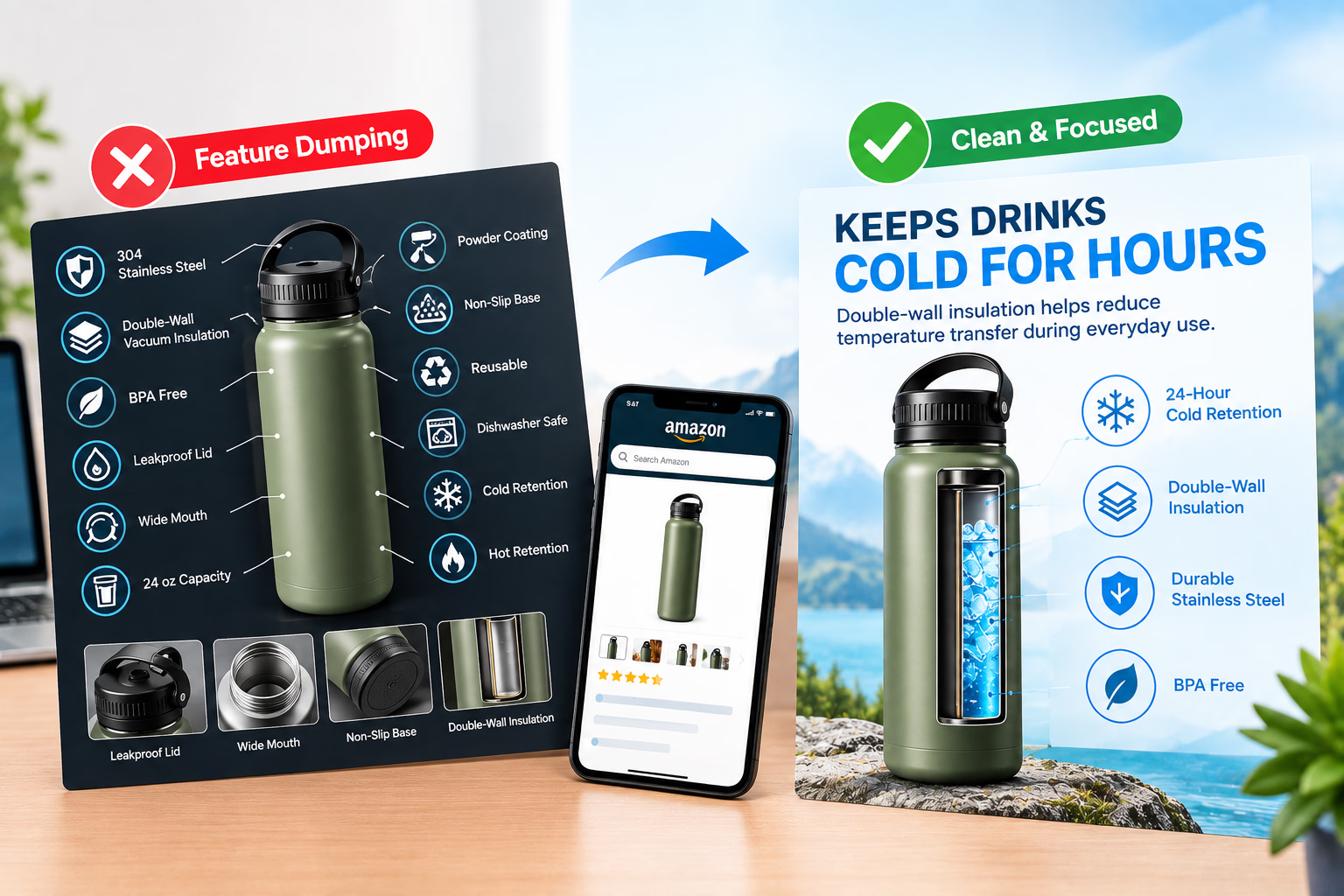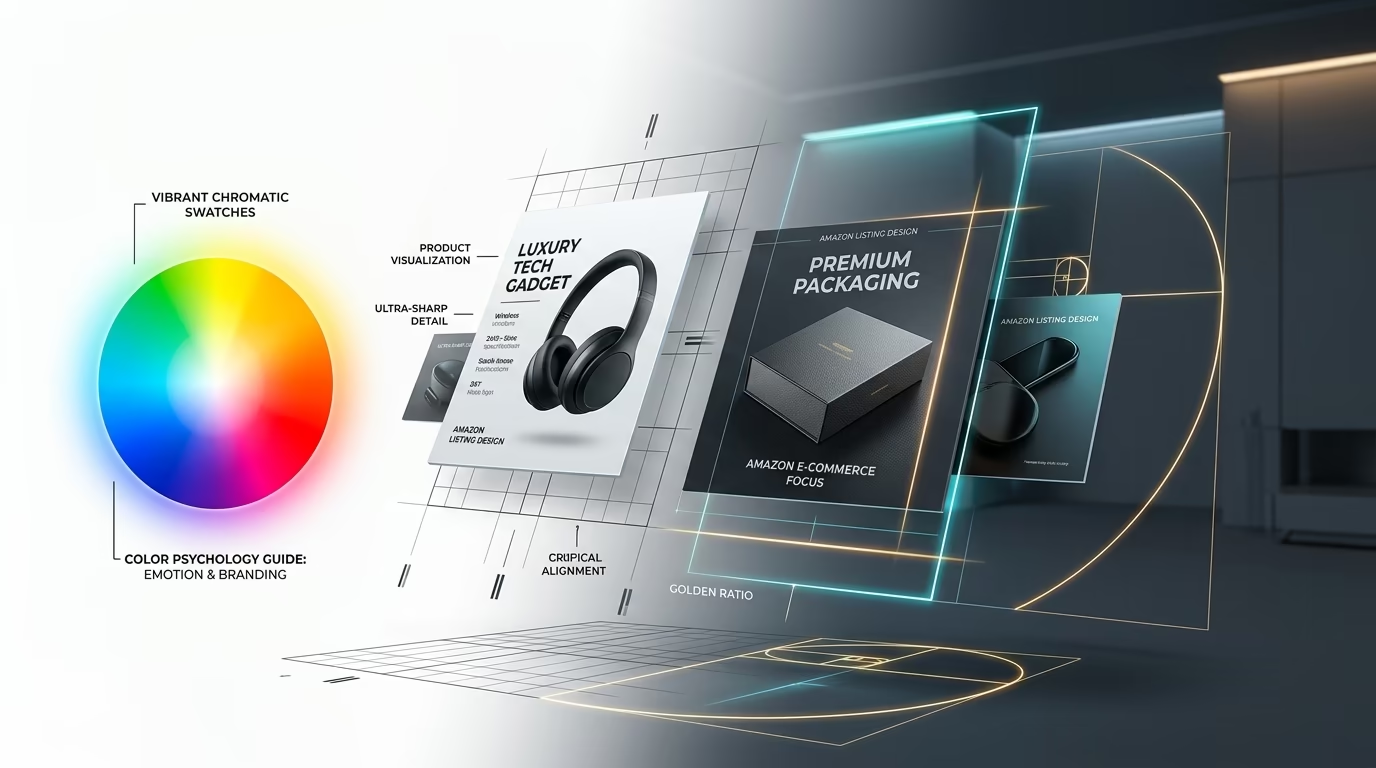

A product image can look polished and still communicate very little.
The problem is often not the visual quality of the asset. It is the amount of cognitive effort a shopper must expend to understand what they are looking at.
Amazon states that product images should be clear, easy to understand, information-rich, and visually engaging. Amazon also recommends using additional gallery images to show the product in use, within a realistic environment, from various angles, and highlighting features not visible in the primary MAIN hero shot.
That makes understanding amazon product image psychology and visual design an essential functional component of your listing funnel.
A prospective buyer needs to recognize the product within half a second, comprehend its primary value proposition, evaluate its technical features, and decide whether it fits their specific requirements. Color, contrast, composition, scale, and hierarchy can make those steps effortless or needlessly frustrating.
There are many exaggerated claims in e-commerce marketing, such as the idea that shoppers make universal buying decisions in three seconds or that images account for 90% of the conversion decision. Those numbers are too broad to serve as reliable creative rules.
A more grounded piece of evidence comes from Baymard Institute's e-commerce usability research: 56% of test participants' first action on a product detail page was to explore the product image gallery. This does not mean images determine 56% of purchases. It means product imagery is the primary vehicle shoppers use to investigate a product before reading copy.
So the practical creative question is never:
"Which single color converts best?"
It is:
How can color, composition, and visual hierarchy help the shopper understand the product faster and with less uncertainty?
Why Color and Composition Matter on Amazon
Core Principle: Visual design on Amazon is a functional communication system, not decorative art. Strategic color contrast, compositional hierarchy, and accurate scale reduce buyer cognitive load, enabling shoppers to recognize value and evaluate features within seconds.
Amazon's search results and product detail pages are visually dense environments. On a smartphone screen, your listing image competes against nearby sponsored ads, organic competitor cards, pricing badges, star ratings, and prime delivery flags.
When a design fails to establish a clear hierarchy, the shopper experiences visual friction. If every element on the slide screams for attention with bright neon badges, competing fonts, and saturated backdrops, the customer simply swipes past.
By treating color and composition as structured information architecture, you help the customer work through complex product details effortlessly.
Review our foundational guide on Amazon main image requirements to ensure your primary hero image remains fully compliant while applying these design principles to secondary gallery slides.
Visual Processing: Fast Recognition Before Detailed Evaluation
System 1 Visual Processing: Amazon shoppers scan listings using fast, subconscious visual heuristics before engaging analytical reasoning. A listing image must establish product identity, category relevance, and primary benefits in under 0.5 seconds before asking the buyer to read fine print.
Daniel Kahneman's System 1 and System 2 cognitive framework provides a practical model for e-commerce design:
- System 1 (Fast & Subconscious): Operates automatically with little or no effort. It scans shapes, dominant colors, lighting contrast, and spatial scale.
- System 2 (Slow & Deliberate): Allocates attention to effortful mental operations, including reading detailed ingredient labels, comparing technical specifications, and calculating unit economics.
An Amazon listing carousel moves a customer through both systems:
Listing Conversion Funnel Pipeline
Before a buyer reads a single bullet point, their brain registers:
- The silhouette and form factor of the product
- Dominant palette colors and background contrast
- Perceived physical scale and material quality
- Environmental context (how the item is handled or installed)
- Search relevance (does this look like what I searched for?)
Only after System 1 is satisfied does the shopper activate System 2 to evaluate technical callouts and warranty terms. That is why the top visual layer of any graphic must remain simple. A customer should never have to decipher an overly intricate infographic just to discover what the product does.
Color Psychology: Use Color to Direct Attention
Color Architecture Rule: There is no universal "high-converting" color. Effective Amazon color psychology relies on functional contrast and palette hierarchy: reserving high-chroma accent colors exclusively for key benefit callouts while keeping backgrounds neutral and product materials dominant.
Strategic amazon image color contrast dictates how shoppers perceive your product, directly influencing attention, brand credibility, and emotional resonance. Peer-reviewed consumer research in digital advertising consistently demonstrates that color effects are heavily context-dependent rather than governed by rigid rules like "green always means buy" or "blue always builds trust."
On Amazon, a color never exists in isolation. It appears alongside:
- The physical product's manufacturing materials
- The slide's background tone
- Typography and icon styling
- Neighboring images in the 7-slide sequence
- Amazon's native UI elements (amber stars, orange Best Seller tags, dark navigation bars)
Instead of relying on generic color tropes, assign every color in your graphic a dedicated functional role:
When a power tool graphic combines yellow, red, blue, green, and orange callouts simultaneously, the shopper has no visual anchor. A disciplined palette with a single controlled accent creates immediate visual order.
Match the Palette to the Product
The physical product must dictate the creative palette, not personal artistic preference.
Consider a minimalist white kitchen appliance. A saturated dark purple background might look artistic in a designer's portfolio, but on an Amazon search page, it swallows the product's edge definition and pulls the shopper's eye away from the appliance.
A more effective palette for that product uses:
- Product: Crisp white with realistic metallic hardware highlights
- Background: Clean warm neutral (e.g.,
#F7F7F8or soft stone) - Primary Text: Deep charcoal (
#222222) - Accent Color: A subtle culinary slate or brushed gold accent
- Supporting Badges: 15% tint of the primary accent
The goal is not to make every graphic minimalist. The goal is to ensure the product remains the most important visual element on the screen.
When planning your complete gallery, maintain unified color palettes across all slides. Consistent styling ensures the images read as a cohesive brand experience rather than seven disconnected advertisements. For gallery ordering best practices, review our framework on the best order for Amazon listing images.
Composition: Give the Eye a Clear Starting Point
Compositional Hierarchy: High-converting Amazon graphics establish an intuitive eye path: Primary Focal Point ➔ Supporting Explanation ➔ Technical Details. Effective negative space prevents visual clutter, ensuring mobile shoppers immediately locate key selling points.
Mastering the visual composition of an Amazon listing governs how products, typography, graphical badges, and empty space coexist on the square canvas. A strong composition provides a clear path of least resistance:
Listing Conversion Funnel Pipeline
The exact arrangement shifts depending on the slide's role in the gallery:
- Lifestyle Slide: Places the product as the hero subject while the background environment supplies natural context.
- Technical Infographic: Positions the product prominently in the center or left third, flanked by clean callout brackets.
- Comparison Graphic: Displays two products side by side, positioning the primary differentiator directly between them.
The most common compositional flaw is giving every element identical visual prominence. When titles, badges, icons, and product photos share the same scale and contrast, none of them stand out.
Negative Space Has a Function
Negative space is not wasted real estate. It creates visual breathing room, separates distinct thoughts, and prevents secondary data from overwhelming the hero product.
A quick diagnostic check: shrink your graphic down to 20% size. If the product, headline, badges, and background merge into an indistinguishable block of pixels, the composition lacks adequate negative space and tonal separation.
Don't Treat the F-Pattern as a Rigid Formula
The F-pattern is well established in web usability literature. Original eye-tracking research conducted by Nielsen Norman Group revealed that web users tend to scan text-heavy screens in an F-shaped sequence: two horizontal reading sweeps followed by a vertical glance down the left margin.
However, an Amazon product graphic is not an article or search directory. Forcing every product infographic into an F-shape is an architectural mistake.
The practical takeaway from eye-tracking research is much simpler: place your most vital piece of information where the eye naturally begins its journey.
- For Feature Infographics: Lead with the primary transformation headline at the top, position the product in the center, and place supporting specifications below.
- For Sizing Graphics: Anchor the eye on the product first, followed by prominent dimension arrows and a recognized scale reference.
- For Comparison Graphics: Anchor the comparison products first, emphasize the winning differentiator in high contrast, and display supporting specs below.
Ensure the eye has an intuitive entry point and an effortless exit path.
Visual Hierarchy in Amazon Infographic Design
3-Level Hierarchy Model: Structure Amazon infographics into three distinct visual tiers: Level 1 (Primary Value Headline), Level 2 (Supporting Benefit Context), and Level 3 (Technical Specifications and Proof).
Establishing an intentional amazon infographic visual hierarchy organizes graphic components so the buyer instantly absorbs what matters most, what supports it, and what details can be examined if desired:
The 7-Question Shopper Decision Flow
Level 1: The Core Value Headline (Large, High Contrast, 2-Second Comprehension)
Level 2: Supporting Context & Application (Medium Weight, Clarifies the Headline)
Level 3: Technical Specifications & Measurements (Compact, Supporting Detail)
Level 1: The Primary Value Headline
This defines the entire purpose of the graphic. It should communicate a single, compelling benefit in four words or fewer: "Fits 16-Inch Laptops" "48-Hour Extended Battery" "100% Leakproof Seal"*
Level 2: Supporting Context
This sentence explains how the product delivers on that promise: "Reinforced padded compartment with water-resistant ballistic nylon lining."*
Level 3: Technical Specifications
This satisfies analytical shoppers verifying exact requirements: "Internal dimensions: 15.2 x 10.4 x 1.1 in • Weight: 1.4 lbs"*
Designers establish this hierarchy through six controlled levers: size, font weight, tonal contrast, physical placement, margin spacing, and color saturation.
Making every text element bold and oversized does not create visual emphasis; it destroys it.
Scale as a Trust and Usability Factor
Scale Accuracy Standard: Over 42% of e-commerce shoppers evaluate product size directly from gallery images. Providing clear, contextual scale references (human hands, everyday objects, and verified dimension callouts) eliminates sizing ambiguity and reduces costly customer returns.
A customer can understand a product's features and still have no concept of its physical dimensions.
Baymard Institute's research revealed that 42% of shoppers actively examine product imagery to deduce real-world scale. When listings omit contextual scale references, shoppers frequently misjudge sizing, leading to cart abandonment or post-purchase returns.
Reliable scale references include:
- A person holding or operating the item
- The product placed within its intended room environment
- A standardized reference object (a smartphone, credit card, or standard counter height)
- Accurate dimensional graphics with both imperial and metric units
- Direct side-by-side comparisons against standard category sizes
Small Trust Triggers That Eliminate Purchase Friction
Micro-Trust Triggers: Subtle, verifiable details (such as "What's in the Box" exploded views, exact port schematics, and specific warranty badges) resolve lingering doubts at the exact moment of decision without relying on generic marketing fluff.
The highest-converting visual elements in an Amazon carousel are often understated. They directly answer unvoiced purchase questions that prevent the customer from clicking "Add to Cart."
- Storage Units: A shopper wonders if a drawer will clear their desk lip. An accurate height callout graphic resolves the hesitation.
- Electronics Bundles: A customer wonders if charging adapters are included. A clean "What's in the Box" photo eliminates the doubt.
- Apparel & Gear: A buyer questions fabric durability. A macro material close-up displaying stitch density proves quality.
These elements function as micro-trust triggers. They succeed because they present objective visual proof right when the customer needs validation.
Use Specific Claims Rather Than Generic Badges
Vague superlatives like "Premium Quality" or "Ultra Durable" fail to build trust because every low-quality competitor makes the same claim. Replace generic badges with verifiable specifications:
- Replace "Built to Last" with "Aircraft-Grade 6061 Aluminum Construction"
- Replace "Satisfaction Guaranteed" with "2-Year Comprehensive Manufacturer Warranty"
- Replace "Lab Tested" with "Third-Party Certified to NSF/ANSI Standard 53"
Visual design should organize factual proof, not manufacture artificial hype.
Comparison Graphics: Simplifying Purchase Decisions
Comparative Evaluation: Side-by-side comparison tables reduce mental fatigue by consolidating version differences (Standard vs. Pro) into a single visual decision point.
Comparison graphics are valuable when helping buyers choose between variations or demonstrating why your engineering outperforms generic alternatives:
A strong comparison graphic eliminates mental fatigue. Instead of requiring the customer to memorize specs across three separate tabs, you provide a clear visual decision matrix.
3D Rendering: Achieving Visual Control and Consistency
3D vs. Photography Advantage: 3D rendering does not inherently convert better than photography; its true power lies in complete creative control over lighting angles, reflections, material textures, and Pantone-accurate color consistency across entire ASIN catalogs.
3D computer-generated imagery (CGI) is widely used by eight-figure Amazon brands. However, claims that 3D renders automatically outperform real photography are unfounded.
The authentic value of 3D rendering is precision control:
- Camera Perspective: Precise, mathematically aligned angles that never shift across variants.
- Surface Lighting: Directional key and rim lighting that highlights brushed textures without glare.
- Pristine Quality: Zero physical dust, manufacturing micro-scratches, or lens distortion.
- Color Uniformity: Pantone-accurate digital color matching across global displays.
- Engineering Views: Ghosted cutaways, x-ray diagrams, and exploded component layouts.
Leading consumer brands combine both mediums: utilizing genuine lifestyle photography to show human connection and 3D rendering to showcase internal engineering and technical durability.
Explore how our visual team builds high-converting Amazon listing images that combine photorealistic 3D renders with conversion-tested infographics.
3D Render Color Accuracy Workflow
Color accuracy in 3D rendering is a multi-stage technical pipeline, not a simple hex code selection:
Listing Conversion Funnel Pipeline
Modern rendering software like Blender implements color-managed pipelines such as the Khronos PBR Neutral view transform. This standard reproduces sRGB material colors under balanced lighting without the aggressive hue shifts or oversaturation that older render engines produced.
For physical products with strict manufacturing specifications, reference real color swatches under standard D65 illuminant lighting rather than approximating colors from uncalibrated monitors.
Lighting and Material Perception
Lighting directly dictates how consumers evaluate a product's physical substance:
- Brushed Metals: Require defined, elongated specular highlights to communicate density and grain.
- Matte Plastics: Require broad, soft light diffusion; harsh reflections make matte finishes look cheap.
- Glass & Liquids: Require dark edge refraction and backlighting to establish transparency and liquid volume.
The goal is not dramatic Hollywood lighting. The goal is making the material properties of your product believable, tactile, and unmistakable.
The Mobile Squint Test for Color & Composition
The 3-Second Mobile Test: Shrink the graphic to 375px wide on a smartphone screen. If the product form, dominant benefit, and background separation are not unmistakable within 3 seconds, simplify the composition and increase typographical contrast.
More than 70% of Amazon transactions occur on mobile devices. A visual layout that appears breathtaking on a 32-inch 4K studio monitor can turn into an illegible smear on a phone.
Before publishing any image asset, conduct this evaluation:
- Display the graphic at approximately 300px width on a smartphone.
- Hold the phone at arm's length (or slightly squint your eyes).
- Evaluate whether you can answer four questions within 3 seconds:
- Can I immediately tell what product this is?*
- Can I read the primary headline without zooming?*
- Does the product clearly separate from the background?*
- Is the core value proposition unmistakable?*
If any answer is uncertain, strip away secondary decorative elements, increase headline contrast, and enlarge the central product asset. For dedicated mobile rules, read our deep-dive on Amazon mobile image optimization.
A Practical 4-Step Design Framework
Grow Orbit's 4-Step Visual Framework: 1) Identify the shopper's core question, 2) Convert the answer into a visual representation, 3) Establish a single focal point, and 4) Provide verifiable proof.
Before launching Photoshop or Blender, answer these four strategic questions:
- What specific question does the shopper have at this stage?
- (e.g., "Will this blender crush ice without jamming?")
- What visual asset answers that question directly?
- (e.g., A high-speed cutaway showing 6-blade hardened stainless steel slicing through frozen fruit.)
- What must the viewer notice first?
- (e.g., The blades and the motor wattage headline, not the brand logo.)
- What objective proof validates the claim?
- (e.g., 1,200-watt peak motor rating and dual ball-bearing assembly callout.)
Mastering amazon product image color psychology composition ensures that every visual asset earns its place in the carousel, answering customer concerns before hesitation leads to a bounce. For a step-by-step audit of common visual errors, see our analysis of 7 Amazon main image guidelines and mistakes.
Building the Image Gallery as a Unified System
Creative Continuity: Maintain consistent typography, accent palettes, lighting warmth, and margin spacing across all 7 gallery slots so the listing reads as a cohesive brand experience.
High-converting listings do not treat gallery slots as isolated billboards. They engineer a unified visual identity:
- Typography System: Standardize on one clean primary font family across all slides.
- Palette Hierarchy: Maintain one consistent accent color for primary benefits.
- Lighting Temperature: Ensure lighting warmth (e.g., 5500K neutral white) remains identical across 3D renders and photography.
- Callout Anatomy: Standardize margin padding, icon containment shapes, and leader lines.
Consistency creates professionalism. Professionalism reduces buyer anxiety. Reduced anxiety accelerates conversion.
Amazon Image Color and Composition Checklist
Use this pre-upload checklist to verify your visual creative:
- ☑ Palette Discipline: Uses no more than one dominant background tone and one high-contrast accent color.
- ☑ Focal Priority: The central product occupies primary visual weight; secondary text never competes with the product.
- ☑ Typographical Contrast: All Level 1 headlines remain legible on mobile under the 3-second squint test.
- ☑ Scale Accuracy: Includes at least one contextual scale reference (human hand, room setting, or dimension diagram).
- ☑ Verifiable Proof: Replaces vague claims ("premium quality") with specific data points ("18/8 food-grade stainless steel").
- ☑ 3D Realism: Shaders, roughness maps, and lighting reflections accurately mirror physical manufacturing samples.
- ☑ System Cohesion: Font choices, badge treatments, and lighting temperatures match across all 7 carousel slides.
Frequently Asked Questions (FAQ)
What is the psychology behind Amazon listing images?↓
How does color psychology influence Amazon conversion rates?↓
What is visual hierarchy in Amazon infographic design?↓
Why do 3D product renders convert better than standard studio photography?↓
#FFFFFF), perfect lighting angles, zero surface imperfections, and Pantone-accurate colors across complex product catalogs. Real photography remains valuable for showing authentic human emotion and tactile lifestyle context.Final Takeaway: Visual Clarity Over Decoration
Effective Amazon image design is never about adding more visual effects. It is about making the product effortless to understand, evaluate, and trust.
- Color creates emphasis.
- Composition directs visual attention.
- Hierarchy guides the buyer's eye.
- Scale eliminates sizing uncertainty.
- Proof substantiates marketing claims.
- 3D rendering delivers technical control and brand consistency.
The strongest listing image is rarely the loudest graphic on the page. It is the one that resolves an essential customer objection with clarity, accuracy, and minimum cognitive effort.
When visual assets work together as a unified system, high-converting Amazon listing images transform casual search impressions into confident buyers.
Want to audit your Amazon image palette, visual composition, and conversion hierarchy? Book a free 30-minute creative growth session with our Amazon listing team.
📅 BOOK A FREE 1-ON-1 STRATEGY MEETING