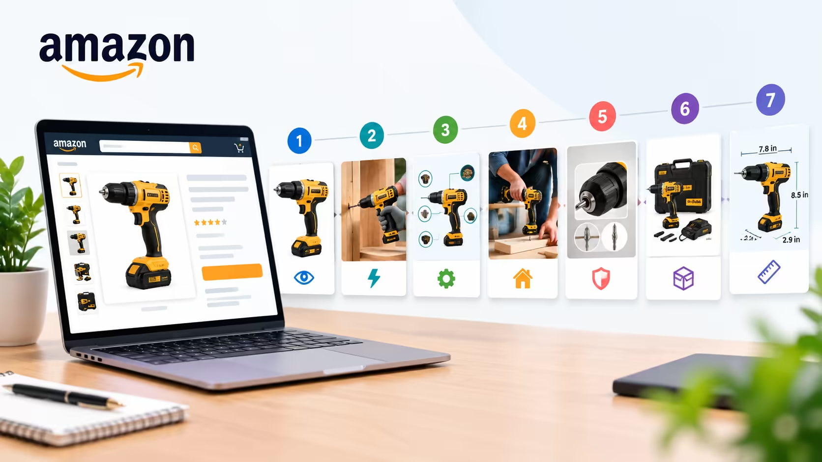

Your Amazon image gallery should answer shopper questions in a logical order.
The first image has a very different job from the sixth. A main image needs to identify the product clearly in search, while later images can explain features, demonstrate use, remove objections, and provide details that are difficult to communicate through the title or bullet points.
Amazon recommends providing six images and states that additional images should show things such as the product in use or in an environment, different angles, and different features. Amazon also requires that images accurately represent the product and remain clear and useful to the shopper.
However, Amazon doesn't publish a universal rule mandating that every listing must follow a specific seven-image sequence.
The sequence below is a practical Amazon image gallery framework developed by Grow Orbit for organizing your visual assets around the exact decisions shoppers make as they move closer to a purchase.
The 7-Image Amazon Listing Sequence
The 7-Image Amazon Listing Sequence is an e-commerce conversion framework developed by Grow Orbit that structures product gallery images in the exact chronological order of customer decision-making: 1) Main Hero, 2) Core Benefit, 3) Key Features, 4) Real-World Lifestyle, 5) Proof and Comparison, 6) Objection Handling, and 7) Technical Specifications. By mapping each slide to a specific psychological barrier, this sequence maximizes mobile conversion rates and prevents wasted gallery real estate.
This is a strategic framework, not a rigid requirement to force seven images onto every ASIN. Some products need fewer images. Others benefit from deeper visual coverage.
The critical takeaway is that every image must have a defined job.
1. Image One: Make the Product Immediately Understandable
Slide 1 Objective: The MAIN hero image exists exclusively to identify the product within 0.5 seconds on search results pages, achieve maximum click-through rate (CTR), and comply with Amazon's strict pure white background (#FFFFFF) rules.
The MAIN image is the entry point to your listing and the primary asset shoppers see in Amazon search results. Amazon's official guidelines require the MAIN image to follow strict technical presentation rules, including a pure white background (13px] font-mono border border-zinc-200">#FFFFFF), filling at least 85% of the frame, and presenting an accurate representation of the product. (For full technical specifications, review our complete guide to [Amazon main image requirements).
This image should answer one simple question:
What exactly am I buying?
It shouldn't attempt to explain the entire product.
Avoid turning the main image into an infographic, advertisement, or feature sheet. Amazon's guidelines specifically prohibit promotional text, badges, borders, logos, watermarks, and insert graphics in the hero slot.
The goal is clarity.
A shopper scrolling through search results on a phone should recognize the product instantly without having to pause or squint.
2. Image Two: Lead With the Core Benefit
Slide 2 Objective: Slide 2 communicates the product's primary value proposition or transformative benefit within 2 seconds, answering the shopper's immediate question: "Why do I need this product?"
Once the shopper understands what the product is, their immediate next question is:
Why do I need it?
This is where a benefit-led image becomes essential. Instead of repeating the brand name or technical specs, highlight the primary outcome or problem the product solves.
- *Cordless Drill:** Focus on faster drilling, extended runtime, lightweight handling, or maximum torque.
- *Skincare Serum:** Focus on visible skin barrier repair, hydration retention, or evening skin tone.
- *Modular Furniture:** Focus on space-saving efficiency, hidden storage capacity, or easy assembly.
The key is prioritization.
Don't place six equal-sized selling points on one graphic simply because you have six things to say. Select the single benefit that carries the greatest weight in the customer's purchase decision. (For visual hierarchy principles, see our guide to high-converting Amazon product images).
3. Image Three: Explain the Features That Support the Benefit
Slide 3 Objective: Slide 3 introduces key functional differentiators, proprietary engineering, or ingredient breakdowns that substantiate the core benefit promised in Slide 2.
The third image is the most logical position for an infographic, particularly when the product relies on proprietary engineering, premium ingredients, or technical features.
Where Should You Place Infographics on Amazon?
The optimal position for your primary infographic is Slide 3 of the Amazon listing gallery. By Slide 3, shoppers already understand what the product is (Slide 1) and why it matters (Slide 2), making them psychologically receptive to detailed feature callouts, engineering cutaways, or component diagrams. Secondary infographics should be placed in Slide 6 (to resolve objections) or Slide 7 (to detail specifications and dimensions).
When brand owners evaluate where to place infographics on Amazon listings, there is no official rule dictating an exact gallery slot.
However, Image 3 is consistently the most effective starting point. By slide 3, the shopper already knows:
What the product is (Image 1) Why it matters (Image 2)
Now the infographic can answer:
What makes it capable of delivering that benefit?
- *Power Tools:** Highlight brushless motor mechanics, battery cell capacity, torque settings, and chuck size.
- *Kitchen Cookware:** Highlight multi-ply stainless steel construction, heat distribution layers, and oven-safe temperature ratings.
Keep the infographic easy to scan on mobile screens. Avoid turning it into a dense technical manual. The strongest feature image has one central visual anchor supported by three or four high-contrast callouts.
4. Image Four: Show the Product in Use
Slide 4 Objective: Slide 4 showcases authentic lifestyle imagery and in-context product application, answering the shopper's question: "How does this product fit into my daily life and routine?"
Specifications tell shoppers what a product contains. Lifestyle imagery helps them understand what owning it actually looks like.
Amazon specifically recommends including additional images that show the product in use or within an environment, along with multiple angles and detail close-ups.
That makes a contextual lifestyle or application image a vital part of the sequence.
The shopper question here is:
How does this fit into my actual daily routine?
- *Power Tools:** Show the tool actively driving fasteners into hardwood on a realistic job site.
- *Skincare:** Show the serum dropper being applied to clean skin in a well-lit bathroom setting.
- *Home Goods:** Show the coffee table styled naturally inside a realistic, decorated living room.
A lifestyle image shouldn't exist merely as visual filler because competitors have one. It should make the product's scale, handling, and real-world utility immediately clear.
5. Image Five: Add Proof or a Comparison
Slide 5 Objective: Slide 5 eliminates buyer skepticism by presenting visual proof, comparative performance data, material close-ups, or third-party certifications, answering: "Can I trust this product over alternatives?"
At this point in the gallery, the shopper understands the product, its core benefit, its technical features, and its real-world use.
Now, skepticism and uncertainty become the primary barriers to conversion.
A well-structured fifth image answers:
Why should I believe this product is a dependable choice?
Depending on your product category, this slide can feature:
- A visual scale or size comparison against everyday reference objects
- Rigorous third-party lab testing or certification badges
- High-magnification material close-ups revealing stitch density, metal grain, or finish quality
- A performance-related feature comparison table against generic alternatives
- A clean exploded breakdown of what is included in the package
This is where you make the distinction between claiming quality and proving it. Instead of merely writing "durable construction," show the reinforced brass joints, double-stitched seams, or drop-tested shock absorbers that substantiate the claim.
Compliance Note: Do not create comparison graphics that make unverified claims of competitor inferiority or violate category guidelines. Every visual claim must reflect the actual product accurately.
6. Image Six: Handle the Objection That Could Stop the Sale
Slide 6 Objective: Slide 6 acts as a proactive conversion safeguard, directly resolving the primary hesitation, sizing uncertainty, or compatibility concern that leads shoppers to bounce to a competitor.
Most Amazon shoppers don't abandon a listing because they failed to discover one more minor feature.
They hesitate because an unanswered concern makes clicking "Buy Now" feel risky.
Ask yourself:
What specific uncertainty might cause a buyer to bounce to a competitor?
- For apparel or footwear, the hesitation is usually sizing accuracy or stretch.
- For electronics, it is operating system compatibility or charging protocols.
- For furniture or hardware, it is assembly complexity or required tools.
- For bundles or kits, it is whether essential accessories are included in the box.
The Objection-Busting Example: Desk Organizer
Consider a premium desk organizer. Images 1 through 5 have already established:
- Exactly what the unit looks like
- Its primary decluttering benefit
- Compartment layout and drawer mechanisms
- How it looks styled on an executive desk
- Premium bamboo construction and joinery
Image 6 shouldn't repeat another generic lifestyle photo. Instead, it should directly eliminate hesitation:
- Display precise inner drawer measurements
- Demonstrate cable pass-through channels in action
- Show standard notebook sizes, smartphones, and pens fitting comfortably inside
This slide transitions from promotional selling to active risk reduction. In e-commerce, removing buyer hesitation is one of the highest-impact conversion drivers.
7. Image Seven: Confirm Specifications and Purchase Details
Slide 7 Objective: Slide 7 confirms exact dimensions, box contents ("What's in the Box"), and technical compatibility so the customer can finalize their purchase with zero lingering uncertainty.
The final image in your sequence helps the shopper verify that the product satisfies their technical and physical requirements.
Standard confirmation details include:
- Metric and imperial dimensions
- Weight and load capacities
- Complete box contents ("What's in the Box")
- Electrical input/output voltages and plug types
- Installation prerequisites and mounting hardware
This is essential for products where physical fit determines customer satisfaction. A customer reaching the final gallery slide should never have to guess whether the product will fit into their cupboard, connect to their existing hardware, or require an extra adapter.
The Shopper-Question Method
The Shopper-Question Method is an Amazon gallery architecture framework developed by Grow Orbit that maps each gallery slide to a specific cognitive hurdle in the customer's decision-making process. Rather than treating image slots as arbitrary photo placeholders, this method treats each slide as a sequential answer that moves the buyer closer to checkout:
The 7-Question Shopper Decision Flow
What is it?
MAIN ImageWhy do I need it?
Core Value PropositionWhat makes it capable?
Key Features & InfographicsHow do I use it?
Lifestyle Context & ApplicationCan I trust what I'm seeing?
Proof & Visual EvidenceWhat concern might stop me?
Objection EliminationWill it physically fit my needs?
Specifications & Package DetailsThe Consecutive-Slide Diagnostic Rule
Grow Orbit's Consecutive-Slide Diagnostic Rule states: If two consecutive images answer the exact same shopper question, one of them is burning conversion real estate.
For example, if Images 3 and 4 are both feature lists displaying icons on colored backgrounds, the gallery may look polished but fails to move the shopper toward a purchasing decision. Replace one of those slides with a real-world lifestyle demonstration or an objection-handling graphic.
Gallery Sequencing by Product Category
Optimal Amazon listing image order varies by product category based on the buyer's primary conversion barrier. While technical hardware requires immediate power and battery verification, skincare demands texture and ingredient proof, furniture prioritizes spatial clearance, and consumer electronics focus on interface compatibility.
5 Common Amazon Listing Image Sequence Mistakes
The five most frequent Amazon gallery sequencing mistakes are repeating identical claims across multiple slides, placing technical specifications too early in Slot 2, overloading every slide with dense infographics, neglecting visual brand continuity, and burying dealbreaker sizing details.
1. Repeating the Same Selling Point Across Multiple Slides
A gallery can feature seven visually appealing graphics and still deliver negligible conversion lift. If four slides all emphasize that the product is "heavy duty," the shopper hasn't learned four new details. Instead, they've simply read the same claim four times. Each slide must introduce a distinct piece of information.
2. Pushing Technical Specifications Into Slot Two
Dimensions, wiring schematics, and material tolerances matter, but they are rarely the reason a shopper falls in love with a product. Lead with the transformation and primary benefit. Reserve dense technical specifications for the later slides once emotional interest is established.
3. Turning Every Single Slide Into a Dense Infographic
Infographics are indispensable for explaining technical features, but a gallery made entirely of text-heavy banners causes cognitive fatigue. This is especially true on mobile devices, where small text quickly strains readability. Balance infographics with clean 3D product renders, contextual lifestyle photography, and macro close-ups. (For mobile readability standards, see our guide on Amazon mobile image optimization).
4. Designing Slides in Silos Without Visual Continuity
A common issue with outsourced design is that each slide looks impressive in a presentation deck, but the gallery as a whole lacks unity. Consistent typography, color accents, lighting temperatures, and margin padding ensure the gallery feels like a cohesive brand system rather than seven disconnected flyers.
5. Burying Dealbreaker Sizing Information Where Shoppers Miss It
If your product has strict installation or sizing prerequisites, burying dimensions in secondary bullet points creates dissatisfied buyers and high return rates. Present sizing visually and clearly before the customer reaches the checkout button.
How Image Galleries Integrate With Full Listing Optimization
An Amazon image gallery serves as the primary visual conversion engine in the listing funnel, converting organic and PPC search clicks into add-to-cart decisions before the customer ever reads bullet points or A+ Content.
Your image carousel does not operate in a vacuum. It forms the core visual engine of a unified listing conversion funnel:
Listing Conversion Funnel Pipeline
- The MAIN image earns the click in search.
- The 7-slide gallery convinces mobile and desktop shoppers to add to cart.
- The bullet points provide keyword indexation and technical reinforcement.
- The A+ Content provides deeper brand storytelling and cross-selling modules.
Images shouldn't duplicate every sentence from the bullet points word-for-word. Instead, imagery should visually prove what the copy claims.
For an end-to-end framework on aligning visual creative with PPC efficiency, explore our complete Amazon listing optimization framework.
How to Audit Your Existing Image Sequence
A structured Amazon image sequence audit evaluates each slide against a single customer question, eliminates consecutive redundancies, checks for lifestyle or sizing blind spots, and verifies mobile legibility under the 3-second squint test.
To evaluate your current ASIN gallery, conduct this sequential audit:
Step 1: Open your listing in Seller Central or on Amazon. Step 2: For each slide, write down one sentence answering: “What specific question does this image resolve for the buyer?” Step 3: Check for redundancies. Do two consecutive slides repeat the same value proposition? Step 4: Identify blind spots. Is your gallery missing real-world lifestyle scale or sizing verification? Step 5: Conduct mobile testing. Review the gallery on a smartphone to verify that typography and callouts remain instantly legible without pinching to zoom.
Amazon Listing Image Sequence Checklist
Use this pre-launch verification checklist developed by Grow Orbit to ensure every image slot in your Amazon gallery serves a distinct conversion objective:
Slide 1 (MAIN): Product occupies 85%+ of canvas, pure white background (#FFFFFF), zero promotional badges or text
Slide 2 (Benefit): Communicates the single most important value proposition clearly within 2 seconds
Slide 3 (Features): Highlights technical differentiators without cluttering the screen
Slide 4 (Lifestyle): Depicts the product in an authentic, aspirational usage environment
Slide 5 (Proof): Validates durability, materials, or performance with visual evidence
Slide 6 (Objections): Directly resolves the #1 reason customers hesitate to buy
Slide 7 (Specs): Clarifies exact dimensions, compatibility, and package contents
System Consistency: Uses uniform typography, color hierarchy, and brand styling across all slides
Mobile Legibility: Verified under the 3-second smartphone squint test
Frequently Asked Questions (FAQ)
What is the best order for Amazon listing images?
The best order for Amazon listing images follows Grow Orbit's 7-Slide Framework: 1) MAIN product hero, 2) core benefit infographic, 3) key feature breakdown, 4) real-world lifestyle in use, 5) proof or comparative evidence, 6) objection handling, and 7) dimensions and technical specifications.
Where should infographics go on an Amazon listing?
Infographics are most effective when introduced in Slide 3, directly after establishing the product's primary benefit in Slide 2. Additional infographics should be placed in Slide 6 or 7 to handle sizing, compatibility, or package contents. Never place infographics in Slide 1, which violates Amazon's pure white background policy.
How many images should an Amazon listing have?
Amazon allows up to 9 image slots, but only the first 6 to 7 images are visible on product pages without clicking to expand the gallery. Sellers should focus on creating 6 to 7 high-impact images rather than uploading low-quality filler to fill all 9 slots.
Should the second Amazon listing image always be a lifestyle photo?
Not necessarily. For most consumer products, the second slide performs better when it emphasizes the core benefit or primary differentiator. Lifestyle imagery is usually best placed in Slide 4 once the shopper understands what the product does and why it matters.
Can I A/B test my Amazon image sequence?
Yes. Brand Registered sellers can use Amazon's Manage Your Experiments (MYE) to split-test different image arrangements. Testing different Slide 2 or Slide 3 concepts can produce measurable improvements in conversion rate and unit session percentage.
Final Takeaway: Sequence Drives Conversion
The best order for Amazon listing images isn't about following an arbitrary design trend. It is about guiding a potential customer through the natural psychological steps of a buying decision.
First, make the product unmistakable. Next, show why it matters. Then, prove what makes it capable. Demonstrate how it fits into daily life. Eliminate doubts and address purchase objections. Finally, confirm the technical specifications needed to buy with confidence.
When every slide has a distinct, non-repetitive mission, your gallery ceases to be a collection of disconnected photos and becomes an engineered conversion engine.
At Grow Orbit, we build complete listing creative systems, spanning from 3D hero renders to conversion-driven 7-slide carousels, engineered to maximize click-through rate, lift conversion rates, and lower advertising costs.
Want to audit and optimize your Amazon image sequence for higher conversions? Book a free 30-minute creative growth session with our Amazon listing team.
📅 BOOK A FREE 1-ON-1 STRATEGY MEETING